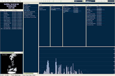
This post explains how to proceed to set a winamp-like layout, like announced in the previous post. It will look like this, and be behaving similarly to winamp:

1. Install the component plugin foo_facets.dll
2. Import media and disable some (I think) annoying features
Go to Menu>File>Preferences, then go to the section "Media Library"
Disable the LibraryViewer Selection Playlist
(If this is enabled, whenever you click on an item in the search results, your current playlist loses focus)
Go to the Menu>File>Playback, then:
- Enable "Cursor follows playback"
- Disable "Playback follows cursor"
3. Prepare layout
In the Media Library Section of the Preferences, go to the "Facets" section
Click on the button "Add New" on top, then enter "Title" in the first column and "[%title%]" in the second cell.
In the dropdown menus at the bottom of the page, chose:
-Selection change: None
-Double-click action: Send to the Facet playlist, start playback
-Middle button action: Add to the Facet Playlist
Comment: The Facet Playlist will replace Winamp's "playlist editor"
"Send" means that the the clicked element (artist, track, album) replaces the current content of the playlist
"Add" just enqueue the clicked element to the playlist
3. Set-up the facets
You can download a ready-made setup, but it is better to make your own at your taste to understand everything. I will describe how to make something that looks a bit like winamp.
The layout is fully customizable. To begin customize it, enable "Layout Editing Mode" :
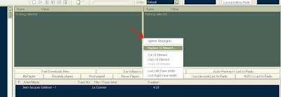
A UI element is an element located in a frame. Replace the two elements on the top-right by the facets by right-clicking on the vertical separator, and chosing "Replace UI Element...". Then, in the "Media Library Viewers", chose "Facets"

You should now have three columns. Add a fourth one with the option "Insert new facet" in the context menu of the element. Then Right click (and chose "Facet View") on the headers of the columns (facets) to chose the content :
- 1st facet: "Genre"
- 2nd facet: "Artist"
- 3rd facet: "Multiple columns" then "Album", then "Artist"
- 4th facet: "Multiple columns" then "Title", then "Artist"
You're done! Now put any text in the search bar above the facets, and their content updates in real-time.
4. Play with the layout
To make something like me:
-Remove the big element on the bottom-right by right clicking on a tab and "cut UI Element"
-Replace the element on the left by a "Split Left-Right"
-By right-clicking in its area, replace the element on the extreme left by a "Splitter (Top/Bottom)"
-Repeat that action
-Add "selection information / album art viewer" in the left-bottom area
-Add "Playlist renderers / Playlist View" in the left-middle area
-Replace the left-top element by "Selection information / Selection Properties"
-Insert the vertical area in the middle by "Utility / Playlist manager"
You can play with the sizes and the split, tabs, and different elements such as equalizer, vizualisations... and do anything you want.
Tip: If you have split an area and want to unsplit it, right-click on the separator and replace it with an element.
Finally, in the Playlist Manager (the vertical area in the middle), double-click on "Facet selection" to display the current playlist in the Playlist View on the left.
Regarding the display of now playing information (at the top-left corner), see that post.
Done!


1 comment:
Hi, I was following your guide to make foobar like winamp, but I noticed the Layout menu has different options (Live editing and Default) than the ones shown in one of your pictures. I suppose these were changed in the latest version. Do you know what to do next??
Post a Comment